
Credit Card Portals –
White labelling
Company: Brim Financial
Role: Product Designer
Tools Used
Project Overview
Brim Financial’s portal delivery process needed to scale rapidly to support fast client growth, but building and maintaining individual custom portals for each client was slow, inconsistent, and resource-intensive. Without a standardized system, updating portals became complex, responsiveness and accessibility suffered, and adapting to each client’s unique branding or product setup required costly manual effort. As Brim expanded within the last year, the lack of scalability, flexibility, and quality control risks became a major bottleneck.
Outcome
We worked on building a scalable portal system using a modular design approach with configurable components, ensuring rapid client onboarding and consistent branding.
We worked on improving the current design system, adding tokens, and assigning variables to components. This helped us create flexibility in our design and could be easily customized for future use cases. In addition to updating the design system, we created a standard of our four product portals, building the pages on auto layout, and applying corresponding tokens to components. This approach streamlined portal development, reduced manual effort, and ensured fast, high-quality delivery for a growing client base.
Role & Responsibilities
I partnered closely with the product and engineering team to gather the requirements, understand how current implementation for a new client is done to understand how to bridge the gap between design delivery to engineering.
I worked closely with QA, and the PM’s along the way to create a configurable checklist. Each client portal prior to this project was highly customizable. QA and PM's helped me curate a list of configurable items that would need to be dynamic. Feature tokens were then set up, allowing for products to be turned on/off across all portals. Ex., a client wants to sunset their rewards system, they need all mention of rewards to be removed from all their banking portals. Being able to make changes across all portals helped to reduce manual work and room for error.
Configurable Layer
There are 3 different file types that are duplicated for clients: base component file, portal component file, and the portal files themselves. After these files are duplicated, tokens are updated in the base component file to the clients branding and a library swap is conducted on the portal files.

All product capabilities, colors, and typography tokens are live in the Base Component File. The base component file is then published and added to all corresponding portals the client is offering.


Primitive colour, spacing, and semantic tokens were created to help define the colours and spacing used within the portals and becomes an outline for future clients as to the colours they need to provide.
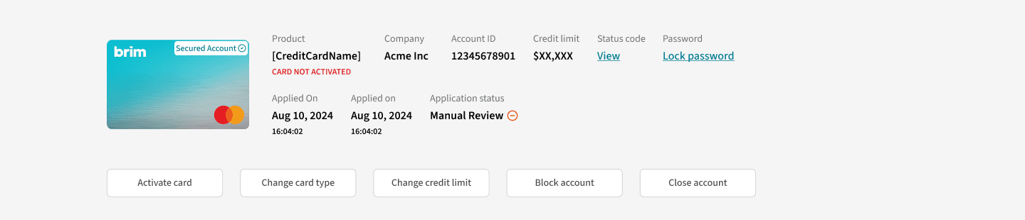

Components were created to accommodate for the 4 primary portals and designed with flexible ease of use taking into consideration multiple aspects such as: what information is shown/hidden in respective portals.


Variables in the base component file were then set up based on a list provided that outlined all the features of each portal, what clients must have, what is optional, and determining features based on product type. The above images are variables set up according to the list that can be set to true or false. Once set to true or false, the library is published, and updated across all respective client portal files, setting those components to be shown/hidden.
Outcome & Impact
Although this project is still ongoing, this transformative project has had early positive results
Reduced Manual Work
All pages of the portals have been templated, designed with variables, and built with auto layout making them more flexible for to be turned/off. This reduced the time spent making adjustments to the layout, updating colours, and fonts.
Organized Workflow
Having a centralized file, Base Component file has increase the organization across multiple portal file. The file acts as a single source of truth.
Reduced Errors
Prior to Configuration Layer each design file had its own style guide. It was the responsibility of the designer to make sure all styles across all portals matched client branding. With the Base Component file errors are reduced by having all components, variables, and tokens referring to a single file.
Challenges & Key Lessons
Bumps along the way, and insights leanred
Challenge: Component Development
There were many challenges developing the components, thinking about the variable requirements, breakpoints, and flexibility. Our biggest challenge was developing components that would be accommodating across different languages, particularly french.
Lesson Take Away
During the beginning and middle stages of development, language wasn’t at the forefront and something we considered. When the PM’s brought this to our attention, there was a big lift to first get english finalized then figure out how we would accommodate for french.
We were able to find a plugin that exported all the english, translate english to french and re-import it back into figma.
This reduced days of the manual work required for the team to be able to visualize how the french screens would look. Based on the translations, we were able to revise component designs and layouts.
© 2026 Silvia Be. All Rights Reserved.