
Configuration
CMS Tool
Company: Brim Financial
Role: Product Designer
Tools Used
Opportunity
Brim helps enterprises build and manage branded credit card programs. As we continue to grow and scale, enterprise clients are increasingly seeking direct control over their programs rather than relying on our team for every configuration change. We have an internal tool that serves our operations team well, but it's built for speed, not for external user experience.
The challenge is transforming this internal tool into an enterprise-grade CMS that gives clients control over employee access, rewards programs, payment configurations, and portal content. Currently, each capability exists as a separate tool—employee access in one system, marketing campaigns in another, balance transfer configurations in a third. This fragmentation means multiple logins, inconsistent interfaces, and complex access control.

Dense interface with no visual hierarchy or clear action paths
Exploring Solutions
Rather than jumping to high-fidelity designs, I worked through multiple concepts to explore different approaches to the core problems. Each iteration addressed feedback and revealed new opportunities.
Early Concepts
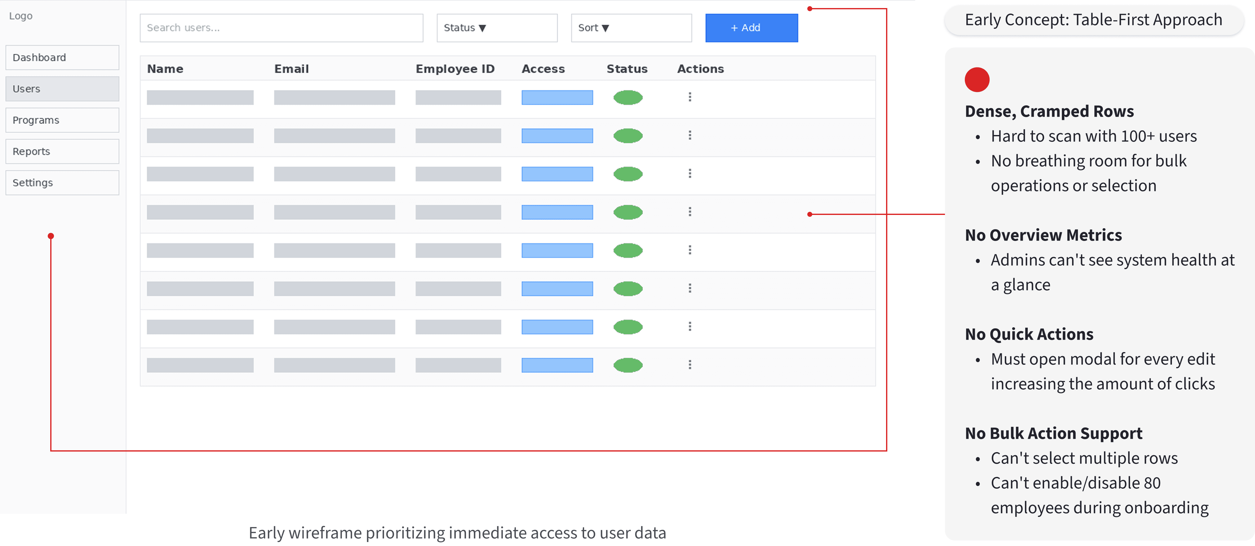
My initial explorations focused on three key questions:
How should overview metrics be presented? Should they be embedded in the sidebar, placed at the top of the page, or integrated into the table itself?
What's the right information density? How much can we show before the interface becomes overwhelming?
Where should primary actions live? Should adding users be a full-page flow, a modal, or a slide-out panel?
Early Concept: Table-First Approach
Refining the Solution
After exploring alternatives, I developed a more refined version that addressed the core usability issues.

Key improvements
Simplified navigation
Clean sidebar with clear visual separation between sections. Collapsible groups for managing complexity.
Improved table design
Better spacing, clearer column headers, and color-coded status badges. Permission levels displayed as labeled badges instead of plain text.
Consistent actions
Edit and delete icons in the same position for every row. Primary 'Add user' button prominent in the top right.
Team feedback
This version worked well, but the team felt we could push the professionalism further. The white sidebar, while clean, didn't feel as polished as leading enterprise platforms. We also needed better visual separation between navigation and content.
QA flagged that the permission badges, while better than text, still needed tooltips explaining exactly what each level could do. We added hover states with detailed capability lists.
The Final Design
Taking the team feedback, I made one more round of refinements that elevated the entire interface.
Employee access management (final design)

Marketing campaign management with dark navigation and overview metrics
Final refinements
Dark sidebar navigation Stronger contrast creates better visual hierarchy. The dark background makes the main content area feel more prominent and gives the interface a more premium, enterprise feel.
Enhanced metric cards Refined styling with better spacing and more prominent icons. The cards now feel like purposeful dashboard elements rather than simple containers.
Permission tooltips Hovering over any permission badge reveals exactly what capabilities that level grants. This eliminated the confusion administrators felt about access levels.
Tabbed navigation
User List and Admin List tabs let administrators quickly switch contexts without losing their place.
Before & After: The Transformation
Comparing the original internal tool to the final CMS platform reveals how thoughtful design decisions compound to create a dramatically better experience.


What I Learned
Competitive analysis reveals patterns, not templates
Studying established platforms helped me understand what enterprise users expect, but copying patterns blindly would have missed opportunities to do better. The goal was learning the mental models, not replicating interfaces.
Multiple iterations uncover better solutions
My first concept wasn't bad, but it took three iterations to find the right balance. The metric cards that became central to the design weren't in my initial sketches. They emerged from team feedback and continued exploration.
Visual refinement compounds impact
The difference between the white sidebar and dark sidebar versions might seem subtle, but that refinement elevated the entire platform. Small improvements in contrast, spacing, and hierarchy made the interface feel significantly more professional.
Cross-functional input improves outcomes
Product managers caught missing functionality. Engineers flagged technical constraints before they became problems. QA identified edge cases during design. This collaboration made the final product stronger than anything I could have created alone.
Enterprise design is about trust
Beyond functionality, the interface needed to signal professionalism and reliability. The visual polish, consistent patterns, and careful typography all contribute to making enterprise clients feel confident in the platform.
© 2026 Silvia Be. All Rights Reserved.